Why Military Pattern Design Translates to the Fairway
Share
Camouflage was never meant to hide. That's the misunderstanding most people carry about it, that the goal is invisibility. It isn't. The goal is disruption: breaking up the outline of a shape so the eye doesn't register it as a whole. The pattern creates ambiguity. And ambiguity, in the right context, is a form of sophistication.
That principle is exactly why field craft patterns translate so naturally to high-end design. Not despite what they were built for, because of it.
Camouflage wasn't designed to blend in. It was designed to make the eye work harder. That's a design problem, not a military one.
A Brief History of Pattern as Design Language
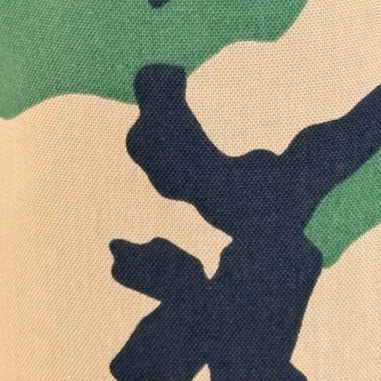
The first modern military camouflage appeared in World War I, developed by French artists, the Camoufleurs, who were recruited specifically because the problem of breaking up visual outlines was understood as an aesthetic problem as much as a tactical one. Picasso, famously, saw a camouflaged truck rolling through Paris in 1915 and said: 'We invented that.'
He wasn't entirely wrong. The visual logic of disruptive patterning, fragmenting a silhouette, layering tones, using organic shapes against geometric planes, was well understood in the art world before it became military doctrine.
What followed over the next century was one of the most prolific bodies of pattern design in human history, driven entirely by functional requirements. The constraint was absolute: the pattern had to work in specific terrain, under specific light conditions, at specific distances. That's a design brief, not a soldier's brief.
The result is a catalog of patterns like Woodland, ERDL, MultiCam, A-TACS, Pencott, MARPAT, each one a precise solution to a specific visual problem. Each one, viewed outside its context, a piece of design work.
Why the Palette Works
Earth tones aren't a trend. They're a reading of the actual color of the world.
Coyote brown. Ranger green. Foliage. Flat dark earth. These aren't marketing names invented to sound rugged, they're functional descriptors developed to match real terrain under real light conditions across real environments. The colors work because they were refined through use, not through a focus group.
That refinement shows. Earth tones photograph well. They age well. They pair with almost anything because they're drawn from the same source material as natural environments. A muted field pattern in ranger green works on a course for the same reason it works in a forest, the visual language is drawn from the terrain itself.
Earth tones work because they were tested. Not by designers in a studio but by people in the field, in real light, against real terrain.
Muted as Sophistication
There's a tendency to read loud as confident and quiet as timid. In design, the opposite is usually true.
The loudest headcovers on any given course, the neon, the maximalist logos, the busy graphics, are working hard. They're demanding attention. The muted pattern, the considered earth tone, the headcover that rewards a second look rather than demanding a first one, that's a different kind of confidence. It doesn't need to announce itself.
In menswear, this principle is called 'the power of restraint.' The suit that fits perfectly needs no pocket square. The leather that's been broken in needs no shine. The pattern that works needs no explanation.
Field craft patterns, stripped of their tactical context and rendered in muted earth tones, operate in this register. They have depth and structure, the layering of organic shapes, the tonal variation within each color family, without noise. They're complex up close and cohesive from a distance. That's a hard thing to design. Military pattern engineers solved it out of necessity.
Why We Chose This Aesthetic
Greyside's patterns aren't a military statement. They're a design choice, one that happens to have the deepest, most rigorously tested catalog of any aesthetic in the world.
We're not asking you to think about the origin when you look at the headcover. We're asking you to look at the headcover. The muted colors. The structure. The way it sits in the bag and somehow looks right alongside whatever else is there — a Vessel, a Titleist, a custom strap, a Jones stand bag.
Field craft finished for the fairway isn't a slogan. It's a description. The visual language was built for terrain. We brought it to the one piece of golf gear that exists purely to carry a point of view.
That's the design decision. The craft behind it is older than golf.